
Preshow
Rick Garcia joined St. Andrew’s Upper School as the new theatre director the same year I started as a student. From a certain point of view, that theatre department started this journey. In the Tech Theatre class, I moved around from set construction to electrical work (which I did professionally) to photographing shows and into stage management (which I still do). Also: when I was a junior, our “Photoshop person” graduated. I’d used Photoshop for years. Could I whip up a poster?
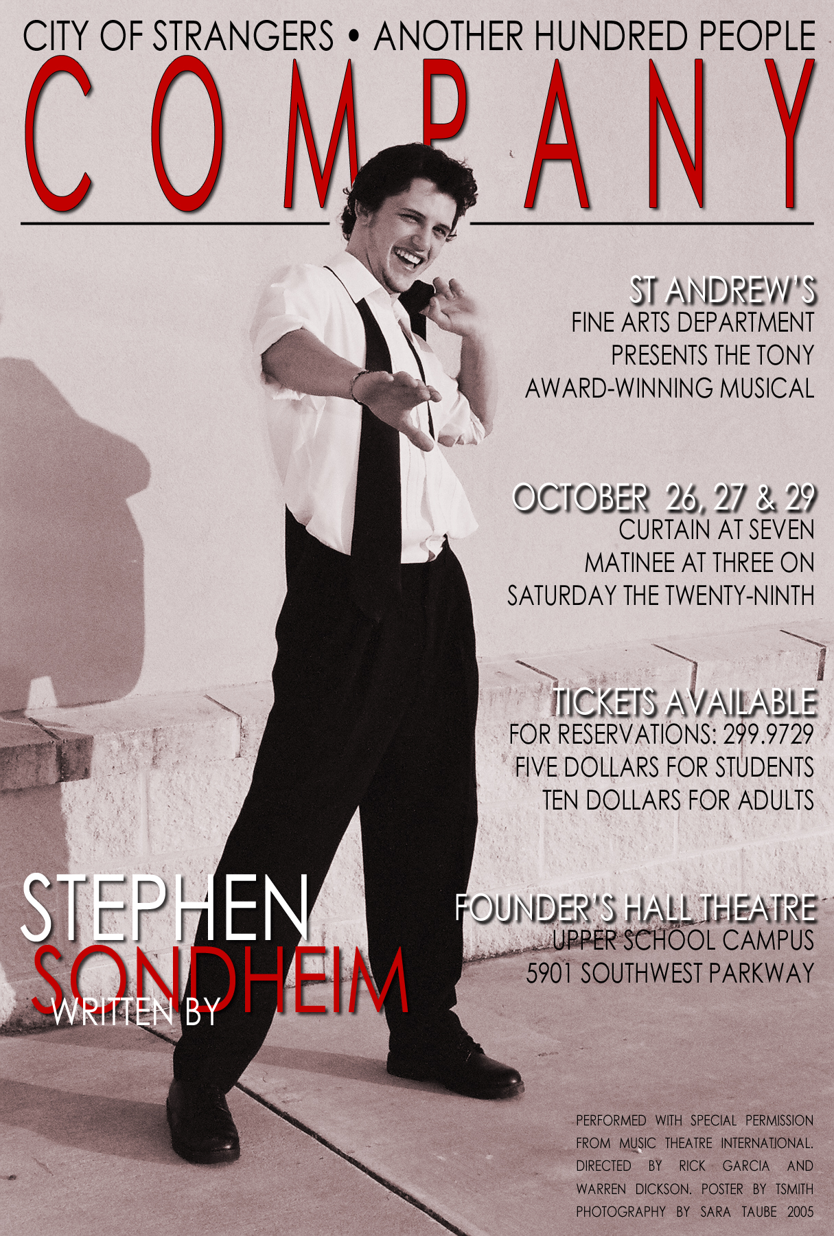
Company (2005), or “Graphic Design: The Overture”
Thankfully, he gave me an achievable mission on my first graphic design adventure for Company. Rick distills his concept for a show into a sentence or visual that he calls “the commanding image.” The commanding image was “a city of strangers,” best explained in the lyrics of the song Another Hundred People. Rick handed me a copy of Vanity Fair, pointed to the cover, and said, “Make this, but with this photo” that an art student took of the lead actor.
Kindly ignore the gratuitous drop shadows and stretched type. 2005 was a lot of learnin’ ago.
After designing pieces for each subsequent show, I decided to attend The University of Tulsa for graphic design. Rick became one of my first freelance clients while I was still a student.
My First Ten Year Account
At 2019’s “Meet the Production Staff” Parents’ Night, two things happened. Peggy, our Production Manager, pointed out that it was my tenth show as a guest artist. Also, a parent I hadn’t met yet asked me who my child was in the show. Apparently, I should sleep more.
In 2021, my first post-Covid theatre engagement was the delayed 2020 production of Evita. It was also my eleventh show as an alumni guest artist — and as it turned out, Rick’s final production before retiring from St. Andrew’s faculty.
Upon hearing that news, I took a stroll through the archives. (And finally finished this draft I started forever ago.) Like Company, sometimes Rick approached me with a strong visual concept to refine. Other years, he turned me loose with abstract ideas to see where I’d run on my own. That mirrored a lot of Rick’s work with his other students: a combination of specific challenges and broad creative freedom. Either way, there is a lot of both of us in each.
West Side Story (2010)
I was a junior at TU when Rick brought me back. Primarily, he wanted a set of backdrops and textiles for use onstage. Then we worked backward, using those to create the poster and other pieces. I even took these to a few class critiques. Commanding image: “Lady Liberty has turned her back on her people.”
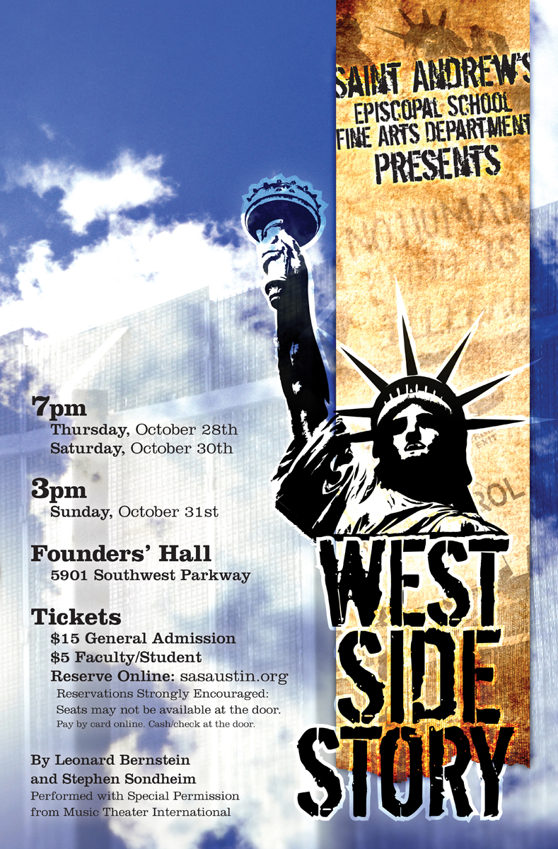
We ordered the backdrops printed at Lamar Outdoor Advertising (the billboard people) in Tulsa.
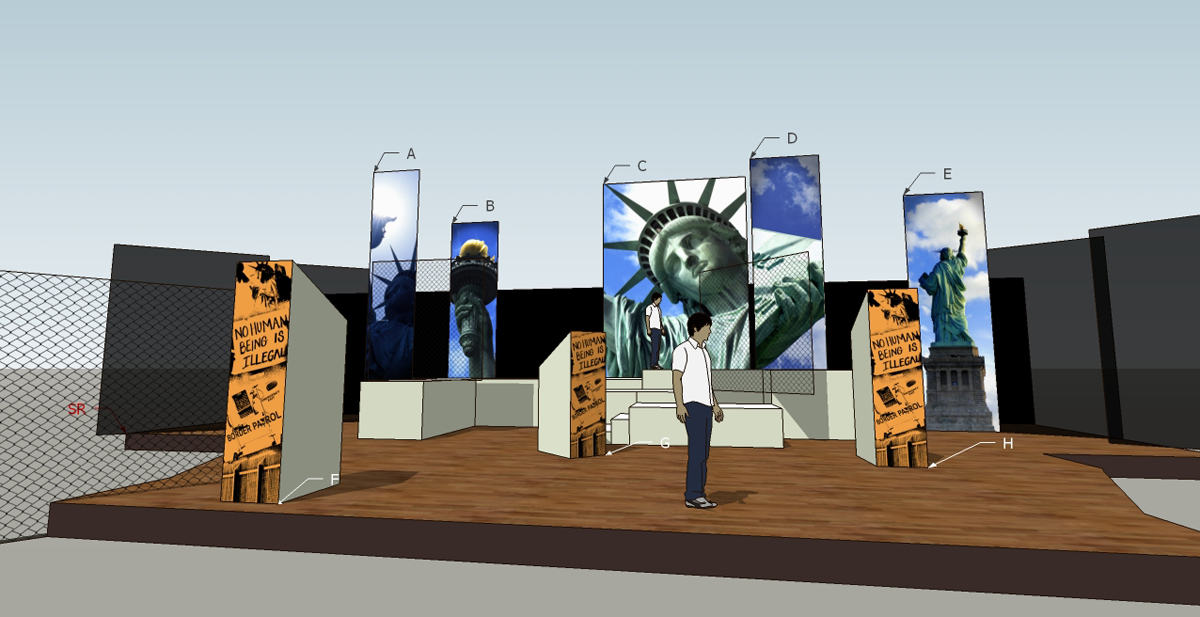
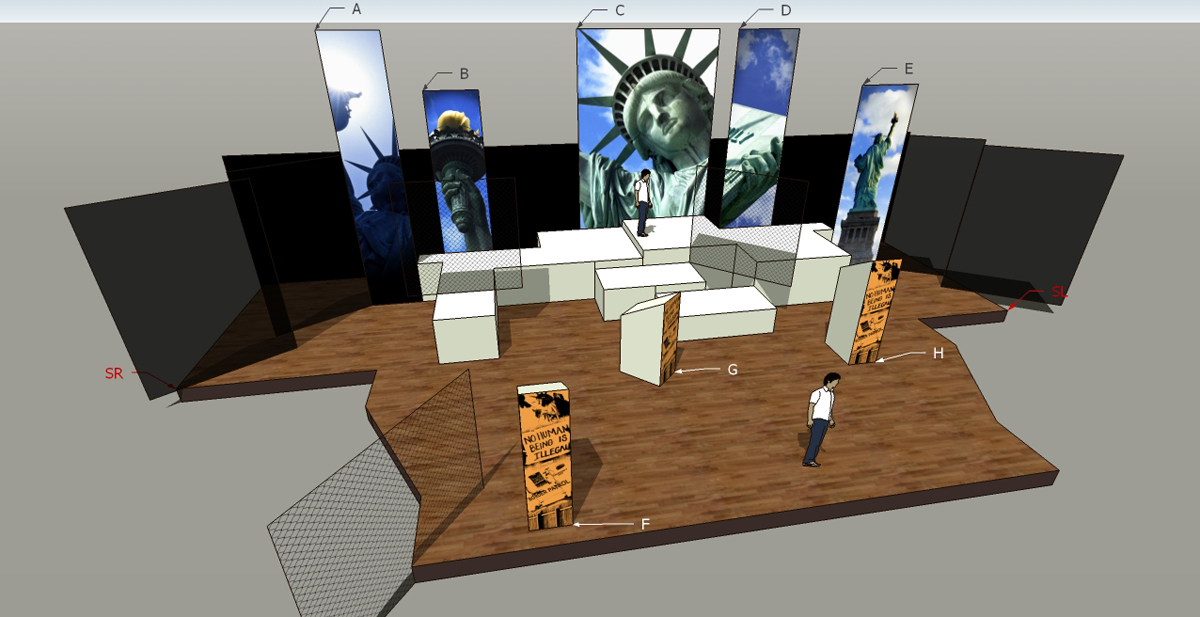
Lamar found it entertaining because it’s a departure from their usual everything. “They’re… vertical! And indoors?” Their team got excited about how to adjust the process to produce a good drop.
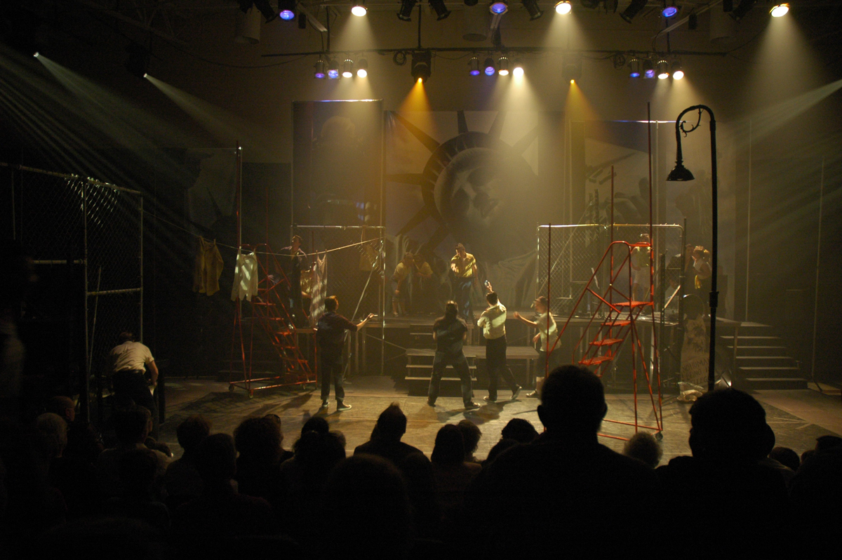
Short of a print job I once ordered that called for a full truckload of paper, this remains the largest physical piece I have designed.
Chorus Line (2011)
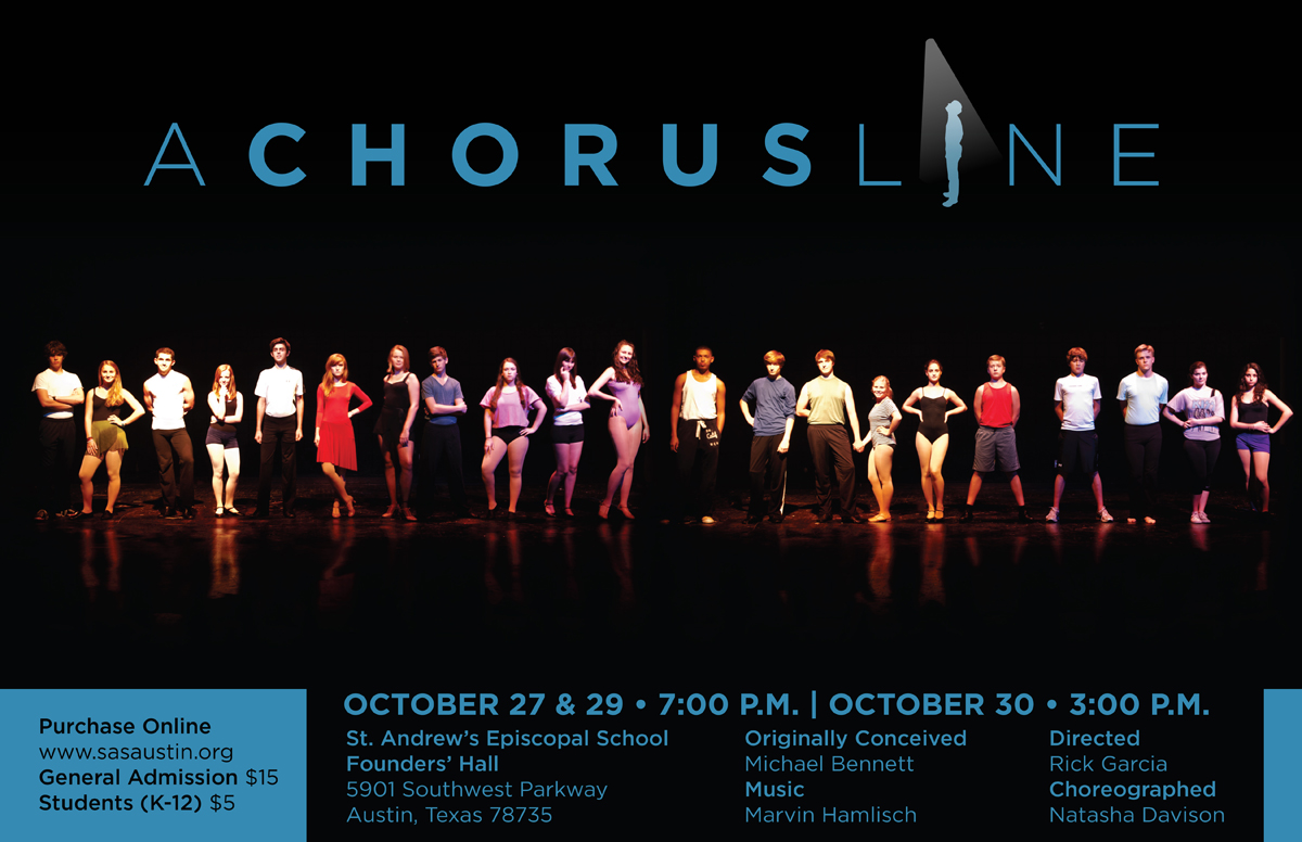
Of all of them, this may be my favorite show wordmark. Simple is good. Peggy did a photoshoot of the cast in-character, which personalized the poster and gave them an exciting sense of ownership.
A Chorus Line has such an individual focus, contrasting the plot’s premise “these are all interchangeable potential cast members, we just need to pick one.” Characters build relationships with the audience through individual scenes or small vignettes as they all audition for the same role in an upcoming show. All the while, the impersonal casting director cuts more and more of them until only one — one singular sensation — remains.
Scarlet Pimpernel (2012)
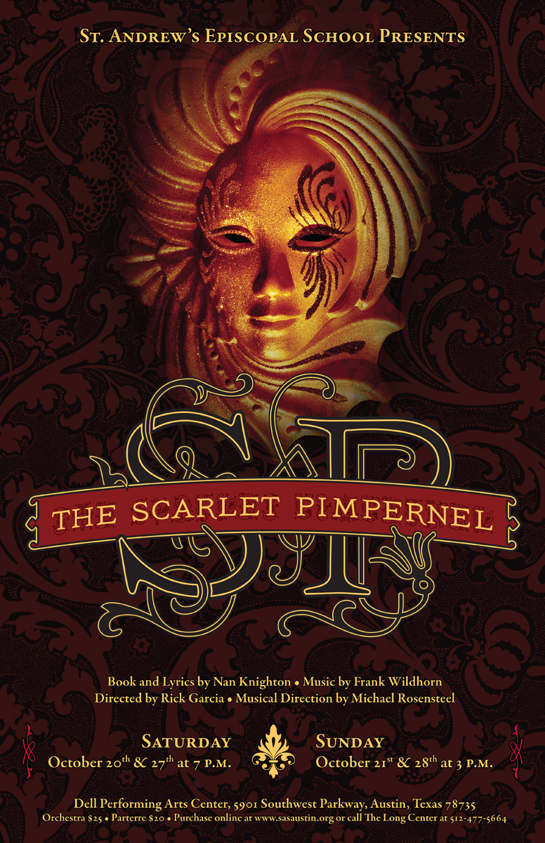
Wherein typography and patterns lean heavily into the flourish of the story of a British fop who, alongside his secret society of unassuming dandies, rescued French aristocrats from the Reign of Terror. The background pattern is a silkscreen my printmaking professor was working on.
Beauty and the Beast (2013)
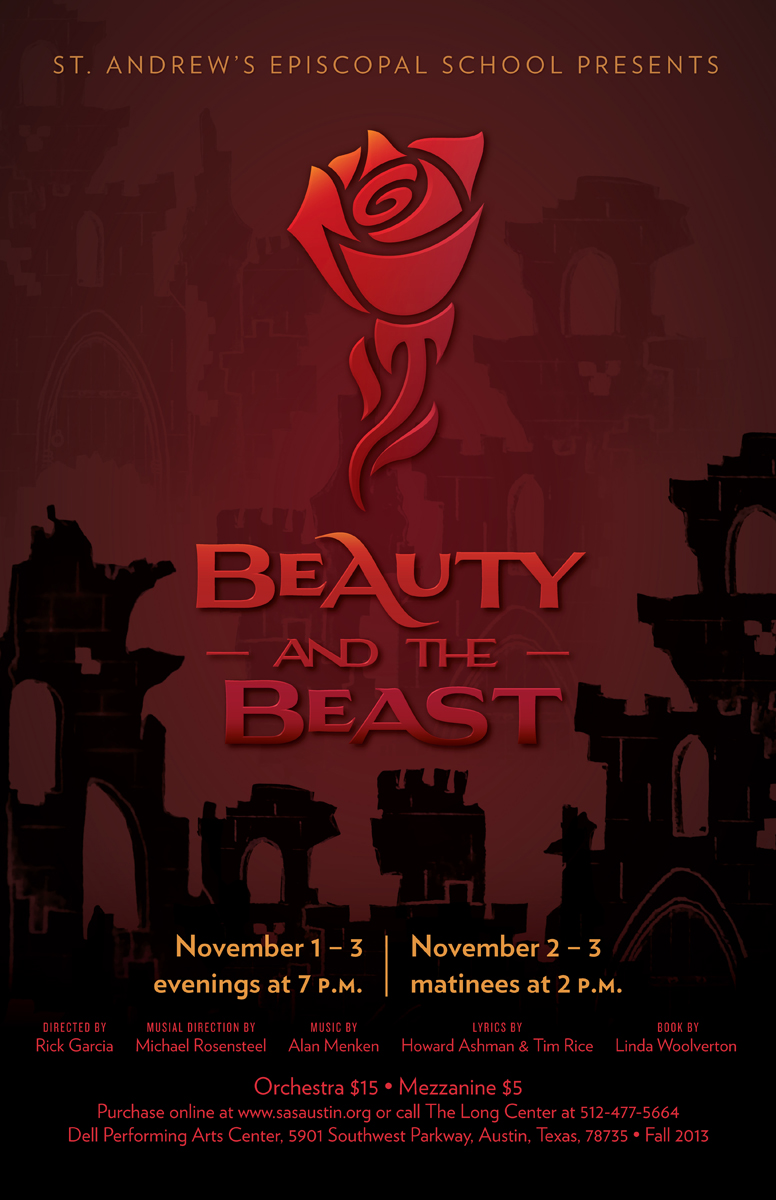
The background is made from photos I took of the set designer’s paper models. I love how that and the wordmark turned out, creating a darker atmosphere than usual Beauty designs. In retrospect, the rose feels out of place, or at least not stylistically consistent.
Rick and I usually steer clear of the common elements people associate with shows so we can make it our own, but we also have to get the point across quickly. The rose is the thing most people associate with this show’s publicity materials, so we kept it that time.
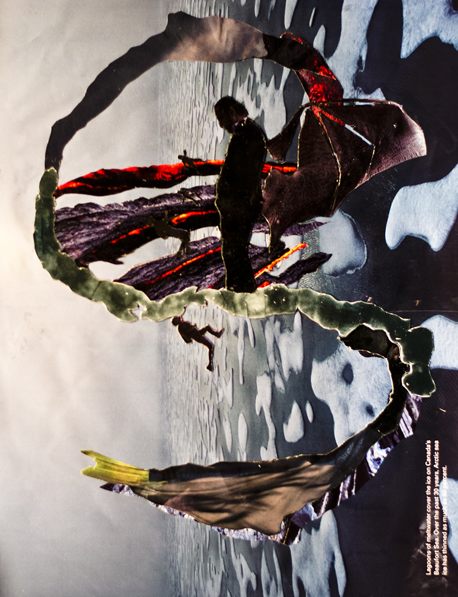
Sweeny Todd (2014)
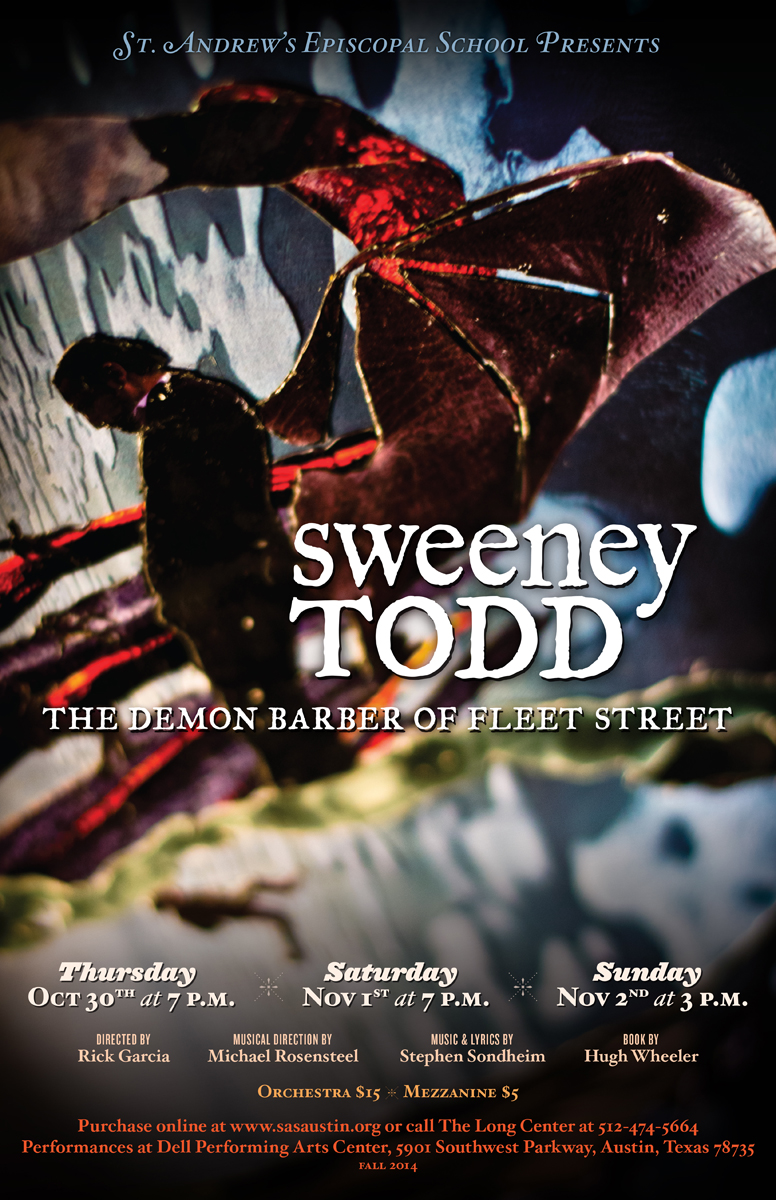
Rick worked with art student Alex L. to create this collage, and the three of us collaborated on incorporating his artwork into our publicity designs. Opportunities to work directly with the students weren’t always possible, but it was always rewarding when we could.
Les Miserables (2015)
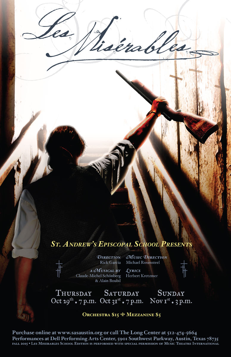
This was the first photoshoot I did myself of a student in-costume and it was fun! The background is a merge of four photos to create the environment. Despite what now feels like over-processing, there’s a lot I like here, but:
Rick, you know what you made me do on this poster and I’m still mad about it. 😉
Legally Blonde (2016)
Commanding image: “Is justice really blind?” And can she look like a stereotypical California beach blonde?
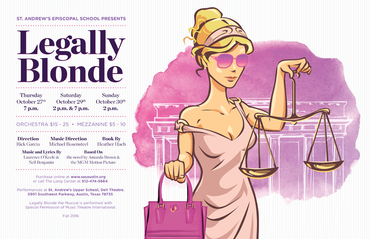
A fun yet stark departure from my usual aesthetic. I’m pleased with the colors, typography, and how I learned to love polka dots. But the primary visual is proof that I was right all along: I cannot draw my way out of a box. Thankfully, iStockPhoto has an entire section of illustrations which I am apparently not too ashamed to mash together.
Catch Me If You Can (2017)
Rick’s commanding image was something along the lines of “the limelight he chases is also the target on his back,” with the specific requirement to include a target or bullseye prominently in the visual.
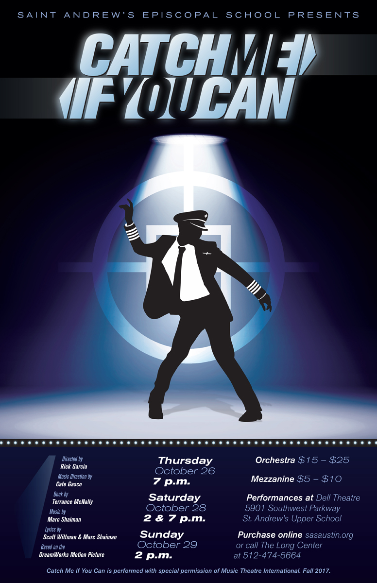
I loved working on that wordmark. The arrow motif was used in the movie collateral, too, but less integrated and with a very different aesthetic. I took the arrow edges to form the pilot’s wings on the poster. Then I 3D printed that illustration for Celia, our costume designer, to use on the uniform:
As it turns out, authentic PanAm wings are both frightfully expensive and too small for the stage. This pin was huge up close, but it read well at a distance.
Jesus Christ Superstar (2018)
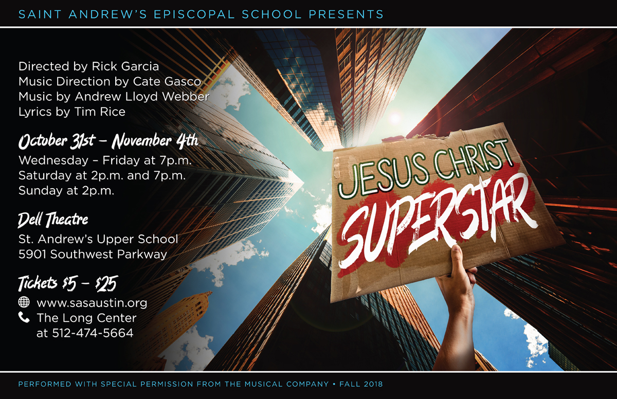
According to the grungy commanding image of this production (and, for that matter, a valid scriptural interpretation), Jesus was a protester. The artwork needed to evoke a street protest or underground movement. This background image was an experiment; everything else I showed was a forward view of a street, rusty warehouse, or protest footage. But he loved the idea of looking up, from the poverty to the glass, juxtaposing two ideas: the ruling class looking down on Jesus and his followers (a central motif of the scenic design) and God being the higher power to reach toward.
Spring Awakening (2019)
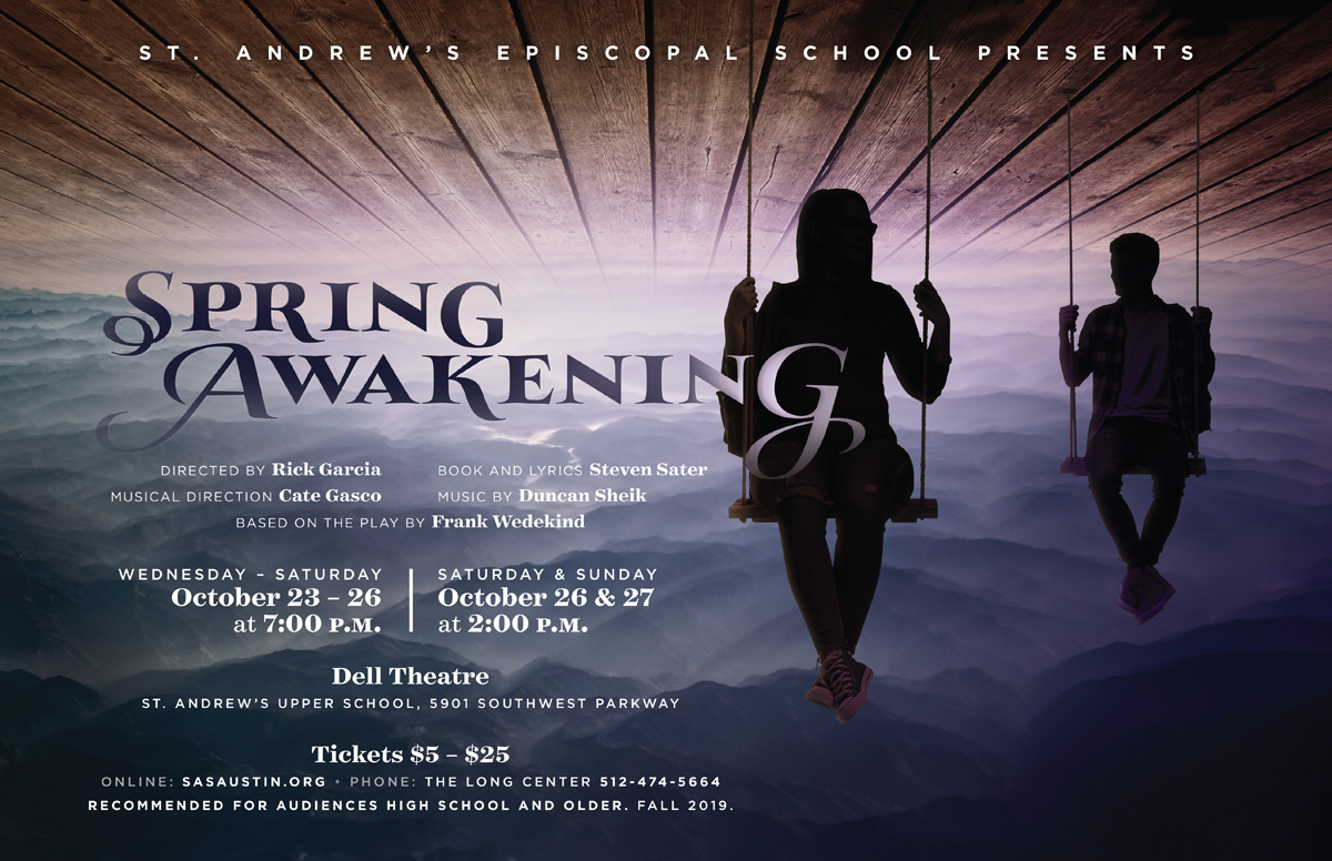
The Spring Awakening visual concept came from a piece of surrealist art Rick found during his initial research. I really wish we’d been able to stage a photoshoot for this one.
Rick also wanted to add an audience participation element into this show, which evolved into us building a web application together.
Evita (2021)
We debated using a photo of Eva Perón for this but didn’t find one we liked. And the production had multiple actors playing Che, partly to reinforce the concept of Che as an everyman — the population of Argentina trying to judge Evita’s legacy. We wanted Che(s) to be in the photo to show that tension. And this get-together represented the start of a long climb out of the pandemic toward getting back on stage. I remember driving home elated.
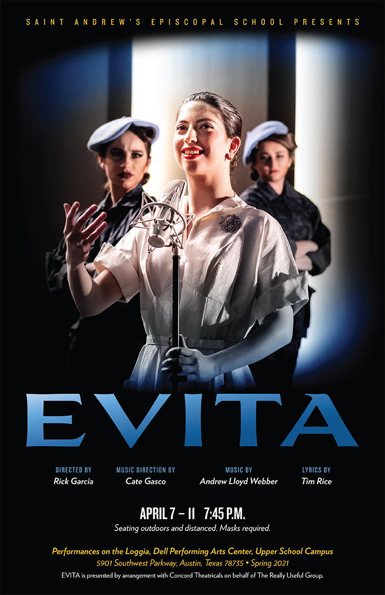
I did this as a socially-distanced photoshoot across the full width of the PAC stage looking out toward a house wall. Our focus was the fog around Evita. It was as much artistic intent as socially-distanced low-light optics that the Che’s were visible but out of focus. The poster is about the populace’s judgemental, pensive inquisition of her sharp, perfected expression.
Rick wanted the trio to “burst through” the Argentinian flag, but I talked him into the blue washes along the top and bottom with a color scheme derived from the national colors of Argentina instead.
Curtain Call
Along the way, I graduated with a BFA in Graphic Design and meandered my way
professionally through being a production artist, web designer, full-stack
engineer for Drupal and WordPress, product owner, and now product manager and PM
coach. Each of these roles benefits from design thinking, a stage manager’s
capacity for orchestration, roadmapping action items from Rick’s wild
abstract ideas, and the speaking experience of having even been cast in a show
or two. (I’d like to think I killed it as the narrating “Laundress #2”
in Metamorphoses.) And I still take on a couple shows each year on the side.
This annual tradition of joining a big team of artists in service to a grand production vision has always been as much a privilege and recharge as it is a feat. At each of the Parents’ Night events, Rick tells his students’ parents about how theatre education has applications well beyond the stage. Being neither an educator nor a parent, my usual job is to tell an abbreviated version of this story to assuage nervous parents who, like my own once did, worry about the academic impact of too much time spent “in the space.” It’s decidedly a lot, but who knows what all it might ignite.
Join me in following Rick’s next chapter at Maestro Arts Project.
Company, West Side Story, Disney’s Beauty and the Beast, Sweeney Todd: The Demon Barber of Fleet Street, Les Misérables, Legally Blonde, Catch Me If You Can, and Spring Awakening were presented through special arrangement with Music Theatre International (MTI). A Chorus Line and Scarlet Pimpernel were performed by arrangement with Concord Theatricals. Jesus Christ Superstar was performed with special permission from The Musical Company. EVITA was presented by arrangement with Concord Theatricals on behalf of The Really Useful Group.